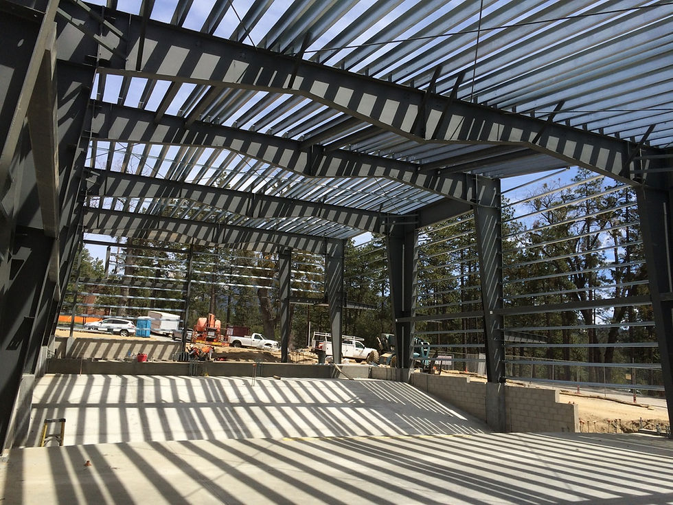
PEMB: Pre-Engineered Metal Buildings
I was building a 10,000SF warehouse and office building in San Francisco in the 1990's, and the contractor suggested we try a Butler-Type prefab building. We received a bid from a Texas company for $60,000 for the building -- major structure, minor structure, roof, walls, windows, doors, ready to assemble. That's $6 per SF. We have been using such structures in or architecture ever since, and the Concert Hall was a perfect project for this technology. There's a steep learning curve to using PEMB structures like this. But we now know the best projects to utilize these economical structures: shape size, scale, bay spacing. All of these are critical to making the project successful. We are also using this system for a 260,000 SF recycling facility in Sun Valley, CA, with 300-foot clear spans. That's larger than the LA Convention Center. PEMB is an amazing system, when used right, and can be entirely flexible.
Working with a PEMB was the first thing we proposed when thinking about how to make a world-class concert hall for a high school that was valiantly fundraising during an economic downturn. For other strategies we started with the basics: simplicity (we call this elegance), context, massing, structure and acoustical requirements and allowed these to lead the way into our design.

"Elegance"
When I teach architectural studios, I often refer to the principle of Elegance, which can be defined as "the complexity of the design problem divided by the simplicity of the solution." A paper clip is extremely elegant in these terms. Just bent wire, used for all kinds of purposes. Some of the best architects in Los Angeles struggle with the concept of how simplicity can help the bottom line. I live by this philosophy: you could say that paper clip is simple and elegant.
So is the William M Lowman Concert Hall in a few ways. In the Lobby, for instance, we used very economical, simple white globe LED lights, each about $100, and hung them in a complex, almost celestial pattern. Simple materials, complex means, rich results. Also the same with the wood paneling in the lobby; we used simple birch veneer plywood. The variation in grain in these panels, from simple tree growth patterns, gives the space a celebratory feeling.

Context: Raw and Rugged
The good people of Idyllwild Arts wanted the building to be brown, like the other buildings on campus, so we decided that weathered steel would fit with the campus aesthetic. We used raw steel panels outside the hall, to give the simple building volume more definition. We wanted something that would provide depth, and took a short segment of the melody line from a piece of music by Richard James (Aphex Twin). We folded the exterior steel panels to match this line, repeated this outside the hall on both long sides. This folding or corrugation echoes the ridges on the granite sides of Lily Rock, the dominant geological outcrop that hovers dynamically over the town of Idyllwild. Thin-plate steel is amazingly economical, and the folding process was easy.

Massing
The impact of the cost of a building can often be determined by its massing.
Simple masses are quicker, easier and more economical to build. In this case, the acoustician for the Hall, Nick Antonio of Antonio Acoustics, wanted just this volume for its sound properties. In fact, the shape of the Hall is quite similar to the Musicverein in Vienna, probably the Hall with the most legendary acoustics in the music world.
So we began with the shape of the volume first. It worked for the building system, it worked for the acoustics, it worked for the design and it certainly worked for the budget.
Acoustics
Nick also asked for diffusing elements above seven feet on the walls and ceiling. Commercial products can balloon a budget rapidly. We began exploring our own ideas instead. It was a short step to using stock lumber 4 x 8 fir members for the ribs that grace the inside of the Hall. These elements are basic and economical, and we placed them at slight angles to each other to evoke trees in a forest: exactly what was needed for the acoustics.

The interior design began with pragmatics, the needs of the acoustician, and resulted in what we hope is a poetic, inspiring hall for the performers and audience alike.
Structure
The Ceiling structure also helped with the our approach to using the basics to inspire our design and maintain the budget. In order to stand both seismic and gravitational loads, the PEMB computer determined that the optimal shape for the roof beams had a shallow 'M' shape along the bottom, chord. We liked this shape, and allowed the diffusing elements that ran along the ceiling to echo this M shape. It turned out, coincidentally to work perfectly for the acoustics but, by this point, we had proven out our theory of "elegance" and we ran with it.
The outcome is a seemingly complex interior that simply follows the fundamental needs of the building and creates a rich result.
